April 17, 2020
Visualize Data With Dash.py – Short Tutorial
Author:

CSO & Co-Founder
Reading time:
4 minutes
Visualize data with Dash.py. The dashboard is today one of the most popular topics in data presentation and visualization. For R enthusiasts there are some excellent tools like Shiny but for Python enthusiasts, there were not such sophisticated tools for a long time. At last, in 2015 appeared Dash as an Open Source library for creating Web-based dashboards and other visual applications. Dash is based on Plotly – a very powerful plot drawing library but is not limited to it, your Python code can do anything you want. Dash is built with React and Flask, which empowers it with modern UI elements like dropdowns and sliders.
In this article, we will show you how to create a simple Dashboard for fast visualization of data, which will be handy for any Data Scientist during the process of Data Exploration.
You may also find it interesting – Data Analytics Consulting Services.
Visualize data with Dash.py: How to create a simple Dashboard for fast visualization of data
Dash can be installed with:
pip install dash
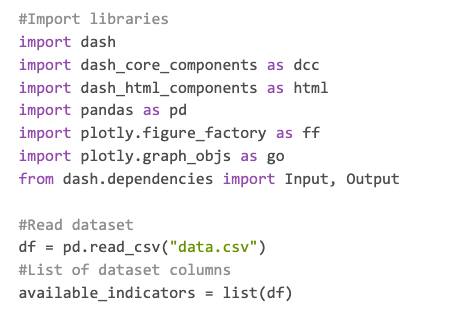
To create a dashboard we need to import dash (also its core and HTML components), pandas for reading and manipulating dataset and plotly for creating graphs. We are loading data written in data.csv and save columns names in available_indicators:

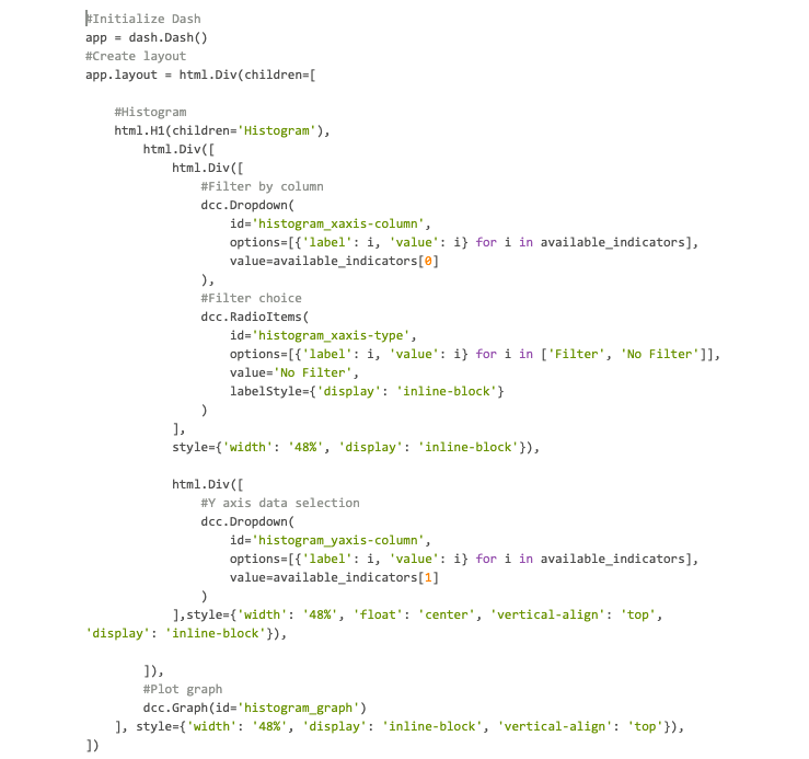
Now we create an app calling dash.Dash() and then we define its layout. In this simple example, we use a histogram graph where we can choose data for x axis and filter it with another variable (not obligatory) using Dropdown components and RadioItems component for enabling filtering.

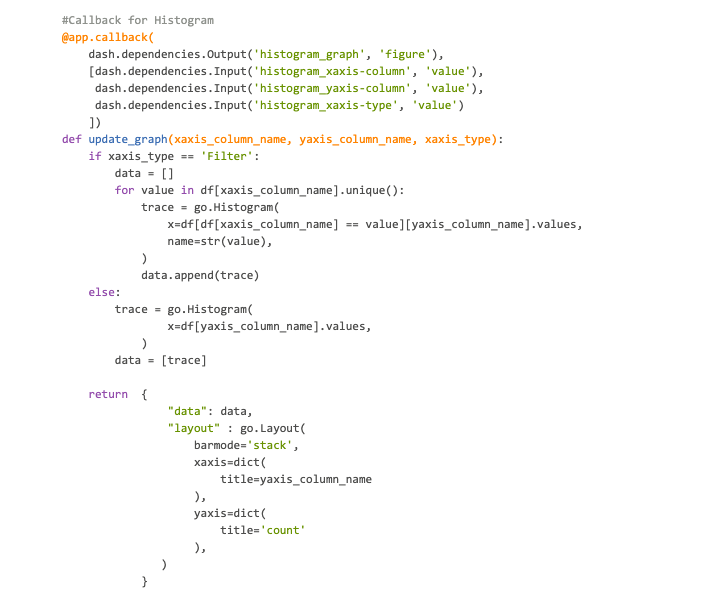
The components defined above need to communicate with the histogram. We create a link between them using @app.callback decorator for an update function. We need to pass to the decorator components id as Input and define histogram as an Output. Then, in the update function, we create logic that changes data passed to a graph based on our actions on the dashboard.

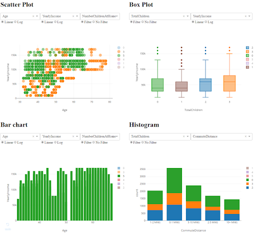
Our shortcode generated a fully interactive histogram. We use the AdventureWorksDW2017 SQL Server database (vTargetMail view) to create a sample dataset. In below example dashboard shows a histogram of education type with a division on daily commute distance.
 The full code is available in a repository. To run dashboard (assuming you installed all requirements) type:
python app.py
As default dashboard will be available on the http://127.0.0.1:8050/. Dataset data.csv should be adjacent to app.py. Any dataset in CSV format where variables are numerical or strings can be visualized so do not hesitate to try your own dataset. Only DateTime variables should be transformed to be understandable by pandas (for example by pandas.to_datetime function) or cast to a numerical value.

Our full example comprises four different chart types:
- scatter plot,
- box plot,
- bar chart,
- histogram,
which gives you an idea of how powerful applications you can create with Dash.
For now, there is no possibility to save the dashboard as an HTML file because then there will be no server to generate graphics also UI components will not work. Developers claim that they are currently working on this problem, meanwhile, we have to run a dashboard with a server.
Visualize data with Dash.py. How to deploy your dashboard?
You can deploy your dashboard in several ways to be available for a broad public. First, you can use Dash servers for enterprises or use platforms like Digital Ocean or Heroku. You may also run the app on your own server.
Dash is an extremely powerful tool to create interactive dashboards and applications. Based on this tutorial you can now build your own app and share it with others. Visualize data with Dash.py.
Category:


